Premium  Download Edit
Download the Measurement and Data: Picture and Bar Graphs CCSS 2.MD.10 Facts & Worksheets
Click the button below to get instant access to these worksheets for use in the classroom or at a home.
Download This Worksheet
This download is exclusively for KidsKonnect Premium members!
To download this worksheet, click the button below to signup (it only takes a minute) and you'll be brought right back to this page to start the download!
Sign Me Up
Edit This Worksheet
Editing resources is available exclusively for KidsKonnect Premium members.
To edit this worksheet, click the button below to signup (it only takes a minute) and you'll be brought right back to this page to start editing!
Sign Up
Not ready to purchase a subscription? Click to download the free sample version Download sample
Download This Sample
This sample is exclusively for KidsKonnect members!
To download this worksheet, click the button below to signup for free (it only takes a minute) and you'll be brought right back to this page to start the download!
Sign Me Up
Table of Contents
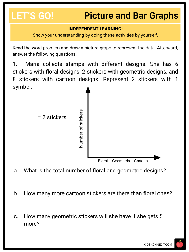
At the end of the lesson, the student will be able to draw a picture graph and a bar graph (with single-unit scale) to represent a data set.
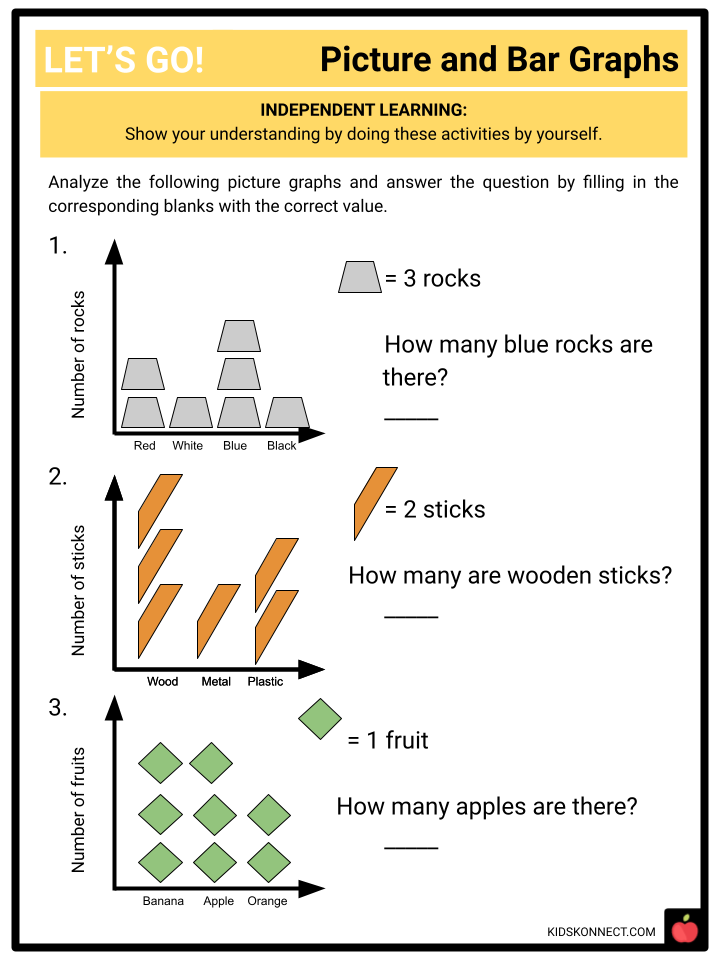
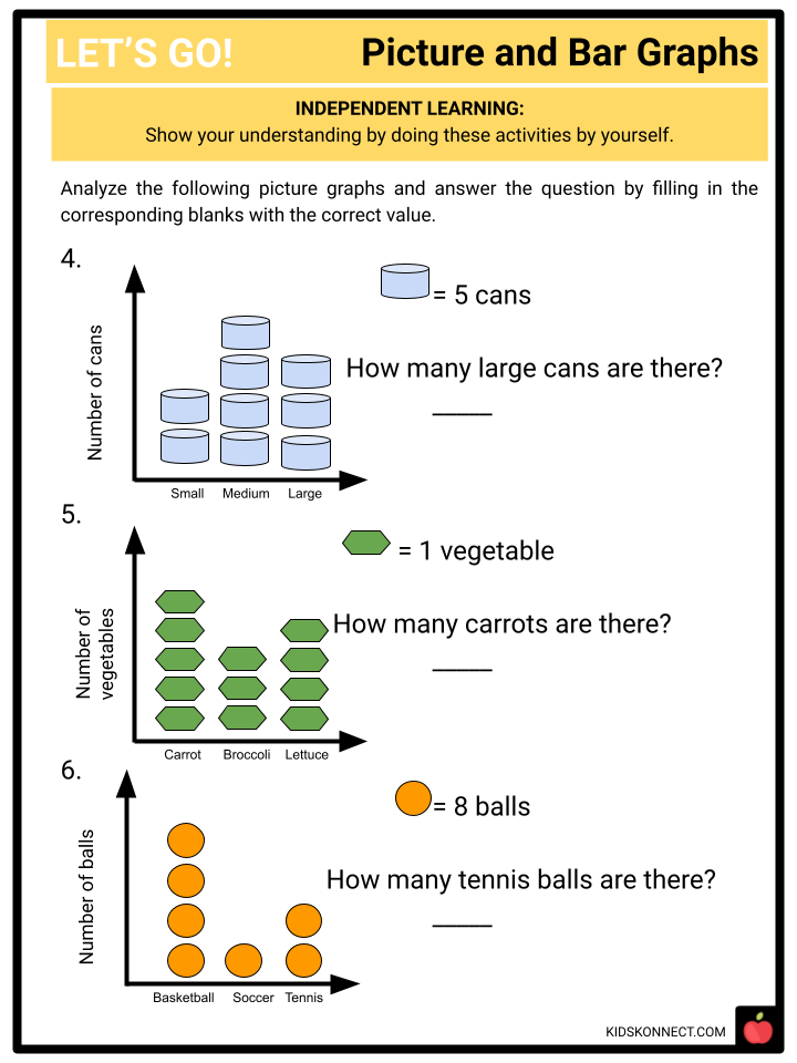
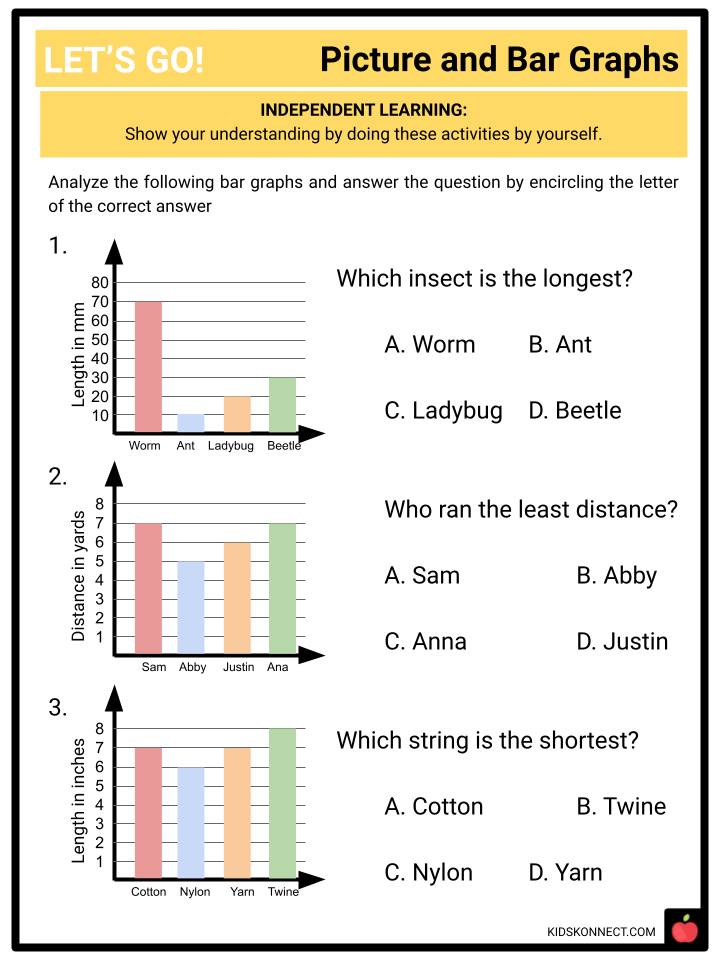
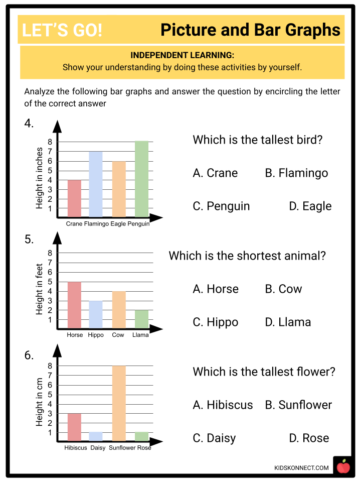
See the fact file below for more information on drawing picture and bar graphs or alternatively, you can download our 28-page Measurement and Data: Picture and Bar Graphs worksheet pack to utilise within the classroom or home environment.
Key Facts & Information
Learning Objective
At the end of the lesson, the student will be able to draw a picture graph and a bar graph (with single-unit scale) to represent a data set. With this knowledge, the student will be able to do the necessary operations concerning the data shown in the graphs.
A Note for the Teacher
When dealing with picture and bar graphs, take note of the following:
- A picture graph is similar to a bar graph because its independent variables are on the x-axis and its dependent variables are on the y-axis.
- Remember that data in picture graphs are represented by symbols.
- Remember that data in bar graphs are read through different heights of bars.
Theory
We learned that measurement data can be generated into different representations such as depicting it in a line plot. To recall, the most distinct use of line plot is to show values of data through a number line.
There are other examples of representations of data. The picture and bar graphs are examples of visual representations of data.
A picture graph contains the following:
- A picture/symbol/icon that is equivalent to a certain value
- The x-axis usually indicates the independent variables of the data
- The y-axis usually indicates the dependent variable or the quantity
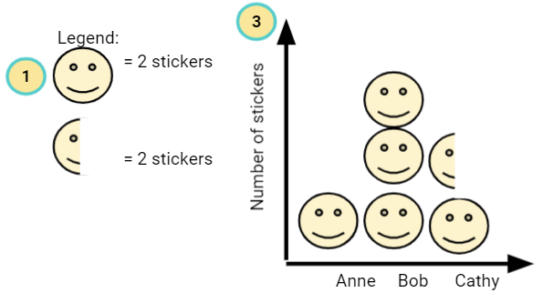
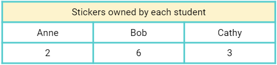
The picture graph above is derived from the data in the table below. Notice the values of each category are depicted as an icon having a certain amount. When dealing with picture graphs, numbers are shown in symbols.
A bar graph, on the other hand, contains the following:
- The x-axis usually indicates the independent variables of the data.
- The y-axis usually indicates the dependent variable or the quantity.
- Different lengths of bars wherein its height (value) is read in the y axis.
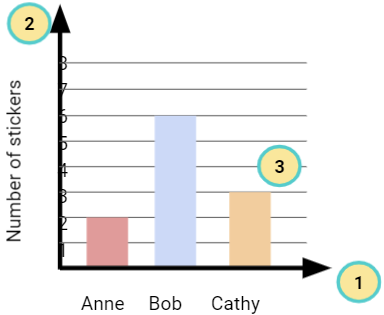
The bar graph above is derived from the data in the previous table. Notice the values of each category are depicted into different lengths of bars having a certain amount. When dealing with bar graphs, numbers are shown in lengths of rectangles.
With this knowledge, we can apply picture and bar graphs in reading and solving data.
Measurement and Data: Picture and Bar Graphs CCSS 2.MD.10 Worksheets
This is a fantastic bundle that includes everything you need to know about Measurement and Data Picture and Bar Graphs across 28 in-depth pages. These are ready-to-use worksheets that align with Common Core code 2.MD.10 for Measurement and Data: Picture and Bar Graphs.
Complete List of Included Worksheets
- A lesson plan
- Warm-up activity
- Math theory explained
- Assisted learning activities
- Independent learning activities
- Extension activities and games
- Answer keys
Link/cite this page
If you reference any of the content on this page on your own website, please use the code below to cite this page as the original source.
Link will appear as Measurement and Data: Picture and Bar Graphs CCSS 2.MD.10 Facts & Worksheets: https://kidskonnect.com - KidsKonnect, August 29, 2021
Use With Any Curriculum
These worksheets have been specifically designed for use with any international curriculum. You can use these worksheets as-is, or edit them using Google Slides to make them more specific to your own student ability levels and curriculum standards.


